You are an online business owner? You are a webmaster? You are looking for the methods to keep your website and business on top of the competition. You want to expand your reach, increase your conversion rate and make the customers happy. Therefore, getting a responsive web design should be your top priority.
Latest Update: We’ve just released the version 2.0 of Claue Multipurpose Magento 2 Theme, with with a bunch of performance improvements and exclusive features. Check this theme out now: Claue Magento Theme 2. 0
Moreover, we complemented the bundle for Free with One step Checkout Extension M2, the extension allows customers to checkout in one step! Check out new features:
- Being based on Luma theme.
- Free with smart One step Checkout (Save more than $200)
- Meet all standards of Magento Theme
- Significant performance improvement
- Compatible with most third-party extensions.
- Fully compatible with Magento 2.4.x
This second advanced version completely differentiates from its previous one. Thus, if you are using Claue version 1 and want to update to Claue version 2, you can only rebuild a new website no rather than updating from the old version. Now, let’s get back the main topic.
In 2015, Google announced that mobile – friendly, responsive web design will boost their search engine rank. Thus, there is no denying that responsive web design has been more popular and important. In this article, we’ll show the essential advantages of responsive web design when your businesses adopt it.
What is the responsive web design?
The responsive web design is optimized for viewing on different types of devices, screens and resolutions. In other words, this responsive web design adapts to the available viewing space . And it offers the users with a nice experience. In addition, users don’t have to move left and right with a scroll bar or zoom in, zoom out in order to read text and view image. So, what is not a responsive web design?
A website that looks exactly the same on mobile as it looks on the desktop (but in smaller size). This is not a responsive web design. With a responsive web design, users can read, navigate and interact with a website on the device they choose without having zoom in or out.
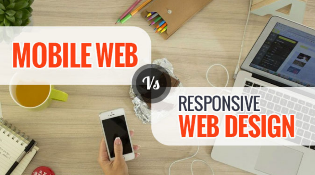
The differences between a mobile web design and a responsive web design
Many people tend to confuse a mobile friendly web design with a responsive web design but that is not exactly the same. A mobile friendly web looks good on mobile devices but may be not good on devices with bigger resolutions. With a responsive web design, there is only on set of pages and one set of code for a website. And those pages adapt in different devices.
Advantages of responsive web design for online businesses
1. Improve user experience
A responsive web design gives users a better experience. And the main element indicating the quality of user experience is the time they spend on your website. If it’s hard to use or navigate because they have to constantly pinch and zoom, they won’t stay on your site.
In contrast, if your website responds to the change in screen size, users won’t find the problems in accessing menus, links, buttons or filling out forms. As a result, this improve the user experience better, then they take more time on your website.
2. Increase mobile traffic
The research shows that nearly 52% of all global web traffic generated from mobile device. Firstly, you examine how many of your visitors come from mobile devices and the time they spend on your site. Then you implement the responsive web design and compare the two numbers. Therefore, when your website adapts to the viewport width, there is an increasing in mobile visits and longer time on site by these visitors. This also helps you keep in touch with your customers and engage with them on every possible occasion.
3. Faster mobile development with the responsive web design.
Creating a responsive web design takes considerably less time than creating a mobile version of your website. Since time is money, the responsive web design naturally costs less than the alternative. In addition, the initial investment of a responsive web design may be more expensive than creating two separate websites. However, you will end up saving costs in the long run due to maintenance costs, special configuration cost, etc of a website that uses two separate versions.

4. Lower maintenance needs
Two versions of your website also require two content strategies, two administrative interfaces and potentially two design teams. Then you have to divide time and resource to manage two site. However, with a responsive web design, your staff can spend less time on maintaining tasks . And you have more time to focus on tasks such as marketing strategies, content creation.
5. Easier analytics reporting
Where traffic is coming and how users interact with your website is necessary to make improvements. Managing two versions of a website requires developers to track user’s journeys through multiple conversion paths, funnels and redirects. On the other hand, with a responsive web design, your web statistic are greatly simplified as you are staying on top of a single set of data. You can still get insight about which devices and browsers are using, where they drop off . And you can know how long they spend on your site. Besides, you will not need to read data from multiple reports to get an accurate picture.
6. Better website loading time
The responsive web design often load faster on all devices, especially on smartphones and tablets. Thanks to the responsive images and fluid grids, it takes less time to load page. This influences on the duration of your user’s visit. Studies show that mobile visitors tend to abandon webpage that take longer than three seconds to finish loading. Therefore, ensuring that your responsive web design uses modern performance techniques such as responsive image display. This improves your webpage’s loading speed.
7. Lower bounce rate
A responsive web design provides a much better user experience for the visitors. Therefore, it is much likely that they will stay at your site longer time which reduces your bounce rate. Besides, visitors may click other pages on your site and explore everything you offer
8. Higher conversion rates
Staying longer on your site and lower bounce rate are good first step to improve your user experience and build trust. Then they lead to better conversion rate. Moreover, making a consistent user experience across all devices is key to converting new customers.
9. Improve SEO
Another advantage of the responsive web design is improved search engine rank. As of April 2015, Google takes into consideration the responsiveness of your websites. It is as one of the signals that determines the rank of your website in the search engine results page. Furthermore, having a single responsive web design rather than separate desktop and mobile versions avoids the issue of duplicate content. This can negatively impact your search ranking. Almost all websites can be made responsive. It’s cost depends on the complexity of website and platform that it is build.
Responsive website examples
Dribbble
Dribbble’s is one of great example for a responsive web design. It comes with a flexible grid which condenses from 5 columns on desktop and laptop computers to two columns on tablets and mobile phones. Besides, to prevent their website from feeling cluttered on mobile devices, Dribbble has removed several items. For instance, shots are no longer attributed to their maker and the view, comment, and like counts are no longer nested beneath each item. They’ve also hidden the menu behind a hamburger icon and removed the search bar.
Papertiger
Paper Tiger is a design agency in New Jersey and its website goes to showcase how when the type of images and typography used is considered in respect to space, the same style can be maintained.
What you get with this site is clean, adaptable typography with great use of line spacing along with bold visuals and dynamic animations that can be seen across all platforms and generating a fun and whimsical experience no matter the device you’re using
github
GitHub’s website deliver a consistent experience across every device for visitors. However, there were a few noticeable differences:
- When shifting from desktop to tablet devices, the area above the fold adjustment from a two-column layout to a single-column layout, with the copy above the signup form instead of beside it.
- Unlike on desktop and tablet devices, where their signup form is a central focus, this website shows only a call-to-action button on mobile. Therefore, visitors must click the call to action to surface the form.
- Moreover, GitHub has also removed the search bar and hidden the menu behind a hamburger icon on handheld devices. This is a pretty common practice, as it allows to reduce clutter on mobile devices, where space is limited.
Magic Leap
Magic Leap offers a designed a simple, mobile-first website with parallax scrolling that deliver their stunning illustrations to life. Given that mobile phones and tablets are now responsible for 56.74% of global internet usage, their approach makes sense. Also, the customers experience is consistent across all devices, with one exception: the microcopy that directs visitors to scroll, which is contained on desktop computers and tablets, but excluded from mobile devices, where it’s natural for users to scroll.
Even with a 3G connection, their site loads in seven seconds—well below the global average of 20 seconds. For a online store featuring responsive animation, that’s not too shabby.
Rally Interactive
Rally Interactive is a great example of a responsive site that attempts to deliver the visitors with the ultimate seamless experience between the mobile and desktop versions of their website. The hamburger menu is the exact same on the desktop version as it is on mobile. The images are the same and pretty much all of the content which contain the back to top button – is the same. However, there are some changes on the mobile version is the two-column text shifts to one column.
Conclusion
If you’re seeking some professional assistance when it comes to building your website responsive, Magesolution can help you. We are a full-service web design and development company providing a variety of web design services. If you don’t make sure what you need? Schedule a free consultation and we can discuss it in detail.