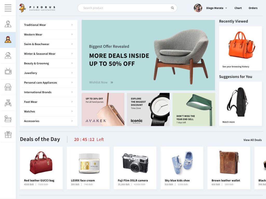
Design is one of the main factors that significantly contribute to the success of an ecommerce website. No matter how excellent a product/ service is, if the eCommerce website looks bad and is unfriendly to use, any business will struggle to boost conversions. Therefore, we’ve gathered the 40+ Amazing ecommerce website design examples in 2022 to inspire you.
40+ Fantastic ecommerce website design examples in 2022

These ecommerce website examples are sure to inspire you to design and create something great. You need to make sure that don’t just build a store, build a brand. Let’s check out each of these ecommerce website examples, one by one.
1. Space Posters
This is an amazing example of visuals tying in directly to the products being sold. As you know that, any ecommerce website should to have a design aesthetic that matches their products, and Space Posters giving a shopping experience that anyone excited by space will find enjoyable.
2. Snapchat
Snapchat does a great job with this ecommerce website. Whenever you buy one of those spectacles and you’ll see what I mean by “smooth checkout flow.” Besides, Snapchat even include Apple Pay as a payment method on its checkout page .
3. Désplacé Maison
Désplacé Maison sells shoes, but not the all too familiar designs we see dotting the shelves at mainstream shoe site. With creative visuals, fun micro-interactions, and a strong visual identity, Désplacé Maison offers great inspiration for those who need to build ecommerce website that don’t follow what everyone else is doing.
4. Wannabe Toys
What makes this design awesome is the product page. Yes, they’re arranged in a grid, but each product pokes up out of the top of each square. Like taking an action figure out of a box, this definitely lifts each product out of its digital square, bringing each one step closer to actually being in a fan’s hands.
5. Lookback
Refreshing, happy visuals make customers feel welcome, and the typography choice improves the positive vibe. Besides, there’s also an excellent product video that supports users to understand the product right on the home page. Together, it all works like a great welcome mat.
6. Burrow
Modular furniture retailer Burrow used a home page video to demonstrate their main value proposition. Besides, using a mix of product and lifestyle pics, Burrow makes it easy to picture their latest designs in your home.
7. Cafe Two 14
It’s not an overly complicated layout, but it’s artfully done to showcase their culinary creations and goods. This is a great example of how simplicity can go a long way in making a customer’s experience more convenient.
8. Everlane
The clothing store Everlane uses high-quality photography to prove to website users that their product will provide. First, customers read why these shirtdresses are worthwhile—you can “just throw one on and go.” The crystal clear images defend this promise by showing how the dresses have minimal buttons, yet also are unwrinkled and crisp. After seeing how easy and great the outfit is, users can easily make a purchase with the “Shop now”CTA at center.
9. Allbirds
The eco-friendly footwear company Allbirds uses color and spacing to highlight their product’s value. Against the muted yellow background, the red color of the shoes sticks out and makes the users website instantly focus on the product. Beyond this contrast, the brand’s value proposition “natural comfort” is placed right in the center, so shoppers understand why they should purchase a pair.
10. Outdoor Voices
Instead of having a separation between the menu and photo, the activewear company Outdoor Voices set the image extend into the menu. This makes the photo more attractive, so shoppers can immediately imagine themselves running outside wearing their apparel. Ready to browse, website users can easily find the CTA since its white color sticks out and it’s at center.
11. Nova Smart Home
This Icelandic telecommunications website comes with a one-of-a-kind microsite dedicated to its smart home devices. Moreover, by using an animated 3D house model, it becomes an interactive product demonstration website for thier products.
12. Insane Boats
“Insane” is a bold statement to have in your business name, and the yellow and black color scheme certainly backs up this proclamation. Besides, these boats don’t gently glide on water, but buzz across the surface with ferocity.
13. Chubbies
The swimwear company Chubbies uses bright colors and photos to deliver user website in a fun vacationing mood that excites them about making a purchase. On their homepage, for instance, they show off their vibrant swim trunks in a tropical jungle environment.
14. Glyph
As you can see from the screenshot below, the Glyph design website calls upon a simply and interesting design and lean content to get its message across. It does so beautifully.
15. Camera
Whether you’re a beginner behind the lens, or the next Ansel Adams, The Camera website has everything a shutterbug could want in pursuing their art. They carry many different cameras, lenses and accessories. Though they sell many products, their drop down navigation keeps everything in order, with a clear organization of product categories
16. Apple
Apple’s website design is all about highlighting its products. Unlike most eCommerce websites, its product pages read like a landing page, with unique selling propositions, social proof, and key benefits.
17. RSVP
This ecommerce website design is interesting and creative. Besides, a lot is going on at every corner of the web page. Literally. But it’s part of the experience of the company.
18. Di Bruno
When you first visit the Di Bruno website, it’s difficult to ignore the design of this ecommerce site. One of the highlights of this site’s design is that they have short descriptions of each of the products, which user website can read when viewing product category pages.
19. Yotti
Yotti is one of the best eCommerce design examples of human-centered design. We all know the gift-buying process can sometimes be difficult, but Yotti solves that issues. Instead of listing product categories, the site asks: “Who are you buying this gift for?” There’s no hesitation in following that line of thinking.
20. Dainty Jewell’s
This is an outstanding example of a clothing ecommerce store with a very soft vintage look. The main colors you’ll see here are light pink, gold, and white, accompanied by delicate patterns. Besides, this ecommerce design goes well with the product that they’re aiming to sell
21. Onfleet
This site has a clean, appealing design. Besides, it’s also chock-full of examples and demonstrations showing how Onfleet’s tracking/delivery management software works. In particular, the nice micro animations create an attractive visual harmony
22. Azteca Soccer
Azteca Soccer’s ecommerce design is a bit unconventional. Instead of going for an online store feel, they decided to deliver their visitors a more boutique experience. One methods that they have achieved this is by using lifestyle shots as opposed to just product images.
23. Ryder
Ryder is on the list because of their strange take on ecommerce website design. Their homepage is not what most online stores look like. But that’s a good thing. Because their web design is unique
24. Dick Moby
Dick Moby sells glasses. Their ecommerce website design is full of great design elements. It’s a great ecommerce website example where the design helps building a unique feeling for the products
25. Home Science Tools
If you have a lot of different products that your e-commerce website sells, it can be challenging to guide your website users to the product(s) that they want. Home Science Tools solved this issues by showing off product categories and using custom elements like “Shop by Age”.
26. Sierra Designs
Sierra Designs is an outstanding example of website design to take inspiration from. Their eye-catching professional photography and user-friendly website delivers an equal balance between a creative aesthetic and a responsive design.
27. Helbak
Helbak is the great example of small business website design that shows off that you don’t have to overdo it. Aldo, their product pages are appealing and clean.
28. Skullcandy
The the ecommerce website design of Skullcandy is simple and creative. Their website comes to life with their colors. Also, they use just the right amount of text and visuals to improve the experience for the website users.
29. Bon Bon Bon
Bon Bon Bon is an artisan chocolate website with a truly impressive and creative website design. There’s a lot going on here, and it all reflects fun. Besides, the website comes with a lot of colors, designs, patterns, and lots of different shapes. Even their add to cart page looks appealing and fun!
30. ban.do
ban.do is a lifestyle ecommerce website featuring a creative and intuitive theme with a touch of vibrant colors. This combination deliver it a youthful spirit, while the easy-to-use navigation makes it hard to exit the website
Related Content:
- Biggest ecommerce challenges and effective solutions to overcome them in 2022
- Ecommerce web design: Tips to position your online shop for growth in 2022
Web design trends for 2022

1. E-commerce sites should be designed keeping in mind their visitors
In order to identify the need for your e-commerce website design, you should specify your need for business, revenue, traffic in your interface. To be more specific, the design should be simple, minimal and elegant, and contains all the information that a customer may need. User experience is paramount to turn visitors into customers and turn customers into repeat customers. If your ecommerce website design is not fit with the purpose, then no matter how your promotion campaign is good or not, the selling rate won’t go up, or even drop down instead. In short, keep your plan clear, clean and maintain the attention on the deal.
2. Keep the user in mind
In general, the product’s purchase rate is related heavily to the customers’ decision. In other words, if your e-commerce website design is in progress, you should put yourself in your visitor’s shoes. What kind of layout is going to be easiest for them to navigate? How can you organize your products in a way that makes sense for the end-user? How can you simplify the checkout process? No matter what question you can answer, always remember: you must make careful choices ‘cause the outcome is followed by the choice that you pick. An easy way that we would like to suggest is that you should consider having a person (relatives, friends) to check your e-commerce website design.
3. Keep your e-commerce website design simple
With regard to have an effective e-commerce website design, simple is always better. The more components you have on the page, the more it detracts from the primary objectives of the site. To be more specific, your e-commerce website must have a minimal, yet elegant and easy-to-track design. This design will eventually focus on mostly selling purpose and may result in the upward spiral of conversion rates increase. The more elements you have on the page, the more it takes away from the entire point of the website – closing a sale. To sum up, keep your design clear, clean, and simple – and keep the focus on the sale.
4. Use colors on e-commerce website design
When picking an appropriate color for your e-commerce website design, choosing an exotic and never-before-seen color and swatches can be difficult and exciting at the same time. Moreover, the combination of colors is also of great concern, ‘cause it represents the professionality of the company, and different colors can inspire different feelings, emotions, and actions from people. So, if you want your ecommerce site to convert, you need to use those color inspirations to your advantage. The point is, color is one of the most powerful tools in your design toolbox, and if you know how to use, it can have a huge impact on your e-commerce website design.
5. Spoon-feeding high-quality images
If your e-commerce website design has no product images, no one is going to buy. If you want people to buy your products, the images must be as clear and qualified at the same time. If you want to have a coverage of your product, remember this: spoon-feeding as much high-quality images as possible, since the users always have a craving for realistic photos. In other words, do yourself a favor and have plenty of high-quality images of whatever you’re selling on your e-commerce site. Your conversions will thank you.
6. A clear site architecture with categorization
For better the user’s experience, and decrease the overload prospect that an e-commerce website owners may encounter, a navigation menu is beneficial for your e-commerce website design. The menu should appear everywhere on the website, from the layered navigation to the sticky navigation. By having this navigation menu, the different categories is specified clearly, as for boosting the conversion rates and improve the customer’s experience. As a result, the overload term will soon disappear and your e-commerce site will flourish on its own.
7. E-commerce sites should have crisp content and social proof
Fact: The customers’ reviews always reflect the quality and the experience that the product can possibly bring to the customers. When your e-commerce website design is in progress, look for ways to show your potential customers the positive feedback you’ve gotten from your existing customers. For example, you could use the product reviews for Magento 2 extension for easy-rating process. The more proofs, the more specific and trustworthy the products will be, and the conversion rates will rise up eventually. In short, the proofs will make up the most about the quality and design of a product.
8. Using grid layout
In order to keep products as organized as possible, grid layout is put into practice, as for bettering the design of your e-commerce website. Grid style formats will, in general, be the best for online business locales and most destinations as a rule. At the point when clients are perusing items, it’s best to keep them in sorted outlines and segments. Moreover, keeping space enables users to think and choose the desired products, and professionalize your website. If you want your customers to take you seriously, you will need to show them you take yourself seriously and a professional e-commerce website design is the best show-up to it.
9. Your content must be scannable
Research shows that most website visitors only have 7 seconds on average to focus on the text on any given web page. Therefore, there is a risk that your idea won’t be delivered completely. In order to get your point across seamlessly, your content should include key information as clearly and shortly as possible. In terms of bettering your e-commerce website design, the easier to scan your content, the more likely your audience will absorb your key messaging.
10. Simple, seamless checkout
If your checkout process is difficult in the e-commerce website design, you’re going to lose customers. If you want people to buy from you, you need to make the process of buying as simple, straightforward, and pain-free as possible. Make your checkout page design clean, simple, and easy to navigate. The steps for the checkout process should be also clear, minimal yet and enough for customers to fully access the payment method. As a result, the customer’s experience won’t be of a disturbance phase, which will boost sales eventually.
11. Make your e-commerce website responsive
In recent years, the development of mobile devices has always been a speedy process. If you want your site to be widespread, the design must be compatible with other platforms such as smartphones, tablets… To be more specific, if you want to capture the customers who want to shop on their phones or tablets, you need to make sure your website design is fully responsive. Otherwise, you might not convince those valuable mobile visitors that your site is where they want to make a purchase. Your site will be optimized and skyrocketed if the design is fully responsive.
12. Make a thank-you page
While it’s widely considered to be important, however, the site which have a thank-you page has better conversion rates than the site that don’t have. By having a thank-you page in the e-commerce website design, this will create a “confirmative” experience for the customers, and easy-to-track conversion rates for online store owners. In other words, if your e-commerce website has a thank-you page, your customers will be assured of the product that they purchase. This will lead to skyrocketing selling rates and boosting the site’s revenue.
The bottom line
So there you have it! The tips and examples for an effective e-commerce website design is in your hand. Need additional help designing an outstanding ecommerce website? We’re here to help! Whether you need help to build robust ecommerce websites, redesign existing websites, or seeking a professional Ecommerce Development Services, Magesolution we provides you with a team of experts who are ready to help you achieve your business goals. Contact us for a free consultation.


